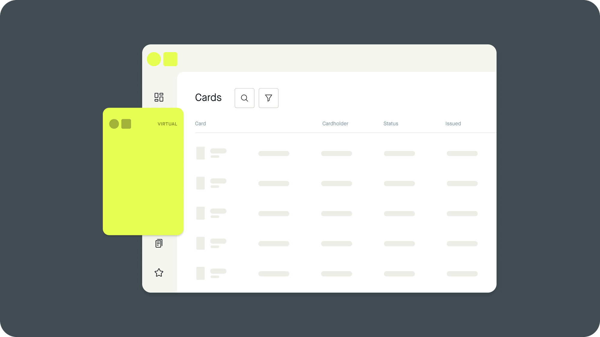
Implementing a Design System into Pliant: Enhancing Product Consistency, Scalability, and Flexibility
Hello, I'm Niko, the Principal Product Designer at Pliant. In my role, I spearhead the product design, constantly striving to elevate our product to the next level. My primary focus is on ensuring that our product remains scalable, flexible, and consistent, key qualities that are essential in the rapidly evolving tech landscape.

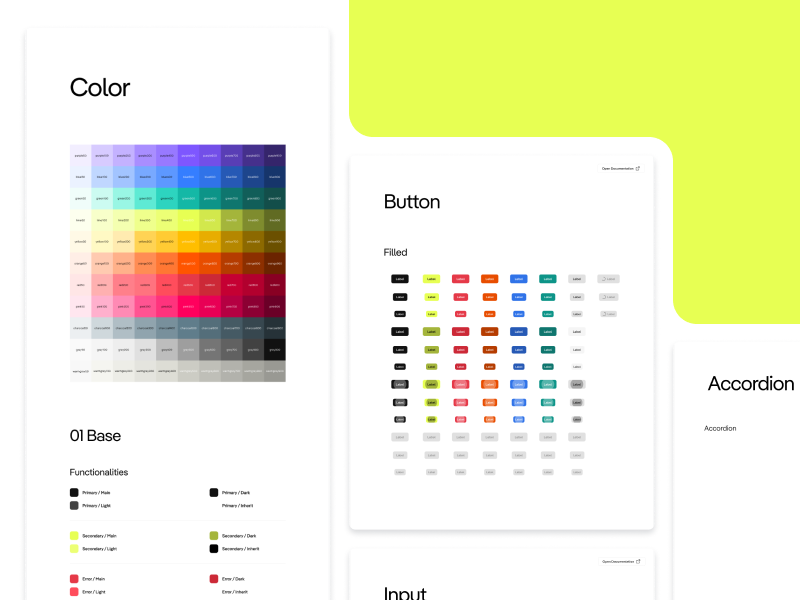
At Pliant, we recently embarked on a transformative journey: implementing a design system that reflects these core values. This article delves into our experiences and insights from this pivotal project, highlighting not only the technical details but also the collaborative strategies that underpinned our approach.
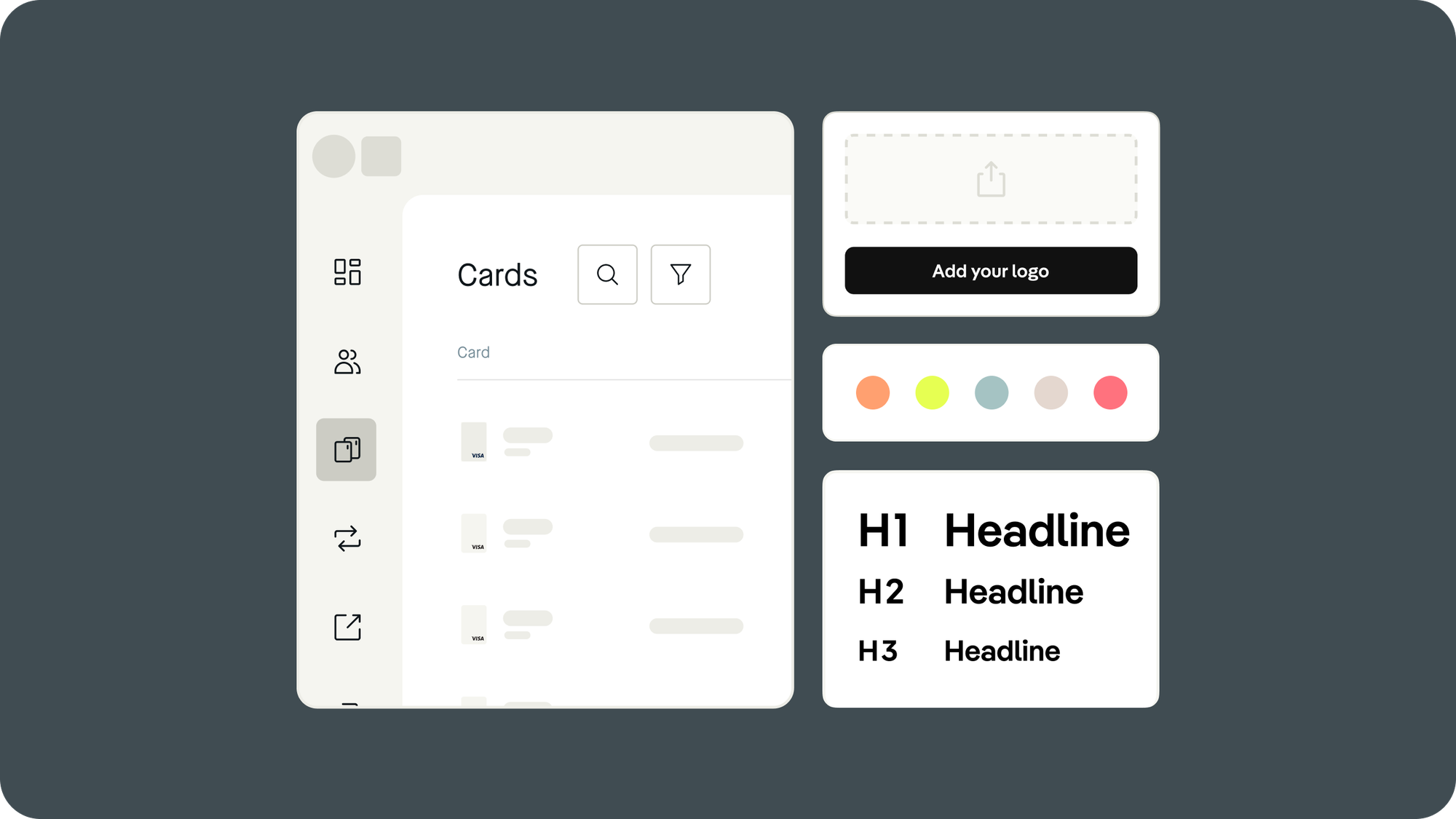
Our approach to UI design
Building a scalable and maintainable product is a critical challenge for startups. Our journey at Pliant in implementing a design system reflects this challenge, with a focus on technical details and collaborative strategies underpinning our approach.
The Need for a Design System
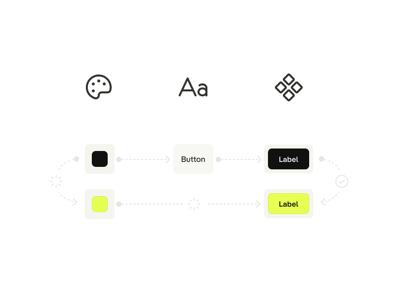
You can find more information about why you should use a Design System here.
Empowering Developers in the Lead
We chose a developer-driven approach for the implementation, relying on their technical expertise to guide the process. This decision was based on the understanding that those who are intimately involved with the codebase are best positioned to make informed decisions about its evolution.
Technical Foundations
Our initial step was to understand the technical requirements of a design system. We explored CSS variables, React component libraries, and other technical aspects that would form the foundation of our system.
Choosing Material-UI
Selecting Material-UI was a strategic decision. We delved into its compatibility with React, its component library, and how its theming system could be adapted to fit our brand. We evaluated its grid system, responsiveness, and ease of overriding styles.
For a deeper explanation of why Material Design or MUI is a good choice, you can get more information here.
Team Dynamics and Workflow
Choosing Dialogs as a starting point
The decision to begin our design system implementation with dialogs was rooted in several key factors:
Complexity and Ubiquity: Dialogs in our app represented a microcosm of the overall UI, featuring a range of elements like buttons, text fields, and selection controls. By starting with these complex components, we could address a wide spectrum of design elements in one go.
High Visibility and Impact: Dialogs are frequently used and highly visible components within our application. Their redesign offered a noticeable improvement in user experience, showcasing the immediate benefits of the design system.
Scalable Learning: Tackling a challenging component first meant that we would quickly learn and adapt our approach, which could then be applied more easily to simpler components.
Deep Dive into Figma and Token Studio
Bridging Design and Development
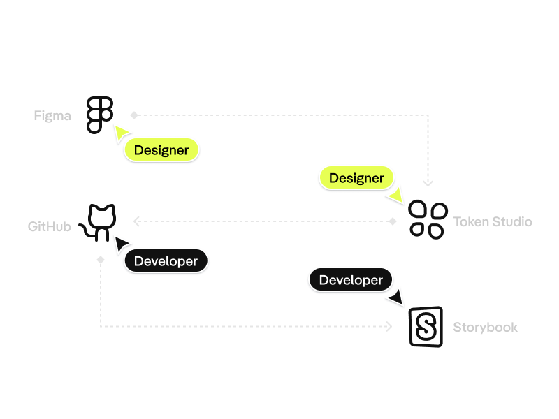
Our approach here was highly collaborative. We held regular sync-up meetings where I as a designer and the developers discussed the feasibility of designs. We just used Figma for detailed design handoffs, ensuring developers had clear UI elements implementation guidelines.
Advanced Documentation Techniques
We use Storybook not just as a documentation tool, but also as a sandbox for testing new components. This approach allowed developers to view and interact with components in isolation, making it easier to spot issues. In Notion, we created a detailed log of design decisions, change histories, and rationales, offering a comprehensive view of the design process.
Conclusion
Our journey was characterized by a deep technical understanding, a collaborative spirit, and a commitment to creating a robust and scalable product. By empowering our developers, focusing on detailed technical planning, and fostering a collaborative environment, we established a design system that is a testament to our team's hard work and innovation.

